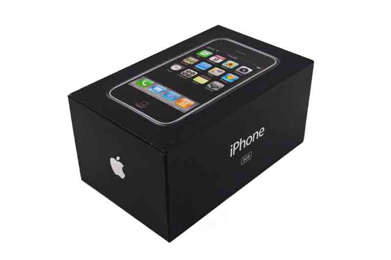
One example of this method being used in production is the iPhone box (as shown below). The box is black because black represents the unknown and mystery, it makes the buyer / audience feel curious and want to buy the product. Another reason why it is black is because it represents power. This suggests that the iPhone is a very powerful phone.

Colour theory is used in a very wide range of areas. These include:
- Adverts
- Film Production - Trailers
- Product Design
- Packaging
- Signs
- Logos and Icons
- Photos
Analogous - Colours next to each other (orange & red)
Complementary - Opposite colours (red & green)
Split Complementary - Two colours close to each other and one at the other side of the colour wheel
Triad - Colours that join in a triangle in the colour wheel
Tetradic - Two pairs of colours arranged into two complementary pairs
Monochromatic - Just one colour, different shades
 |
| Analogous |
 |
| Complementary |
 |
| Triadic |
 |
| Split-Complementary |
 |
| Tetradic |
Ontology [ontological] - Perceived wisdom (eg.Sun relates to yellow, grass related to green, sea relates to blue).
We also played an online game, which helped us understand the main terms of Colour Theory.

No comments:
Post a Comment