Monday 31 October 2016

Project Connect Scenario

There are several aspects of Project Connect. Here are some examples that you should be aware of.


Respect

This means that you respect other people's opinions. 
For example, someone is telling you their opinions on something on the news recently and they totally disagree with the responses to that event.

Instead of laughing at them because they are wrong, you go along with their opinion but offer them alternatives or suggestions. You 'talk' about it, not 'argue' about the topic.

Consistency

This means you are ALWAYS to arrive on-time everyday, every lesson. If you are late, you're to inform the college when you think you will arrive.

Purpose

Make everyday count. Gain as many skills as you can everyday and put them into practice. For example, if you learn about Adobe Photoshop in a session, go home and practice using those skills learnt over and over again in order to pass the coarse.

Responsible

You and only you are responsible for your own actions. This includes verbal, physical and electronic. You MUST follow the codes of conduct, which also include those that apply for computer usage.

Self-Development

Meaning that if you have been set some work to do that only takes a few minutes to complete, finish the work and re-check the work to see if there are any improvements to be made. Then, aspire to do more, perhaps do it again using a different method.

Friday 14 October 2016

Creative CV Interview Feedback

The interview for the creative CV went well. I included all the key aspects of the CV including:
  • Colour theory
  • Shape theory
  • Gestalt theory
  • Typography
  • General Design
  • Why it is appropriate
Including this into my interview shows that I understand my CV, why I designed it that way and what it will do to help me to get a job.

The in the interview I also used key and descriptive words like 'limitless'. I also suggested why I didn't use other fonts, texts and design features. This showed a key part in the interview as it showed I was open minded. I also felt confident within my interview although I did use fillers like 'erm' and long pauses. This didn't appear to have any significant affect on the progress of my interview but that could be an important aspect to improve upon. This also reflected on the positive feedback, which showed that I had good wording and that I answered any questions with ease and that I have met the recommendations within the brief.


Creative CV Evaluation


My CV uses the basic black and white to show that it is very professional. The black is used to show strength and greatness while the white is used to show purity and truthfulness. These two colours not only contrast each other well but has a very appealing look to the CV.

I have used Sans Serif fonts to show that the CV is modern, crisp and sharp. The reason I have not used Serif fonts is because it does not give a professional look to the CV in the way that is presented. I have kept the text as readable and legible as possible by minimising the use of big paragraphs. However, where there are lines of text, I have kept the leading close enough to follow but not too far as to take up too much space. I have attempted to keep the tracking even throughout the CV as it prevents the page from look uneven.

I have mainly used circles in my CV as these show perfection, smoothness and limitlessness. This reflects on my personality as a potential employee. I have however used some rectangles. This is because they are used to show what qualifications I have gained. This presents itself to be sturdy, immovable and strict meaning that these are the grades I have, no more, no less.

The Gestalt Principles I have used are 'continuity'. This is because the reader will automatically look at the top left corner, which means the first thing he will see is my name and how to contact me followed by my interests.

The content of the CV is very basic and to the point. You can look at it and instantly know half of my life in a few seconds. This makes the CV very legible and can quickly find any information again with ease.

Wednesday 12 October 2016

Project Connect - Poster and Self Evaluation


Above is the Project Connect Poster I have created. Below are my evaluations of my work.

Colour theory: I have used many colours within my poster. These include blue, orange, green and red. This is because I needed multiple colours to create the tetradic colour method. This means that the overall poster appears quite vibrant but not too bright as to look over colourful. This is because the poster needs to look professional as well as to attract attention. I have used two shades of blue because I want this to be one of the dominant colours on the poster. This is because blue represents an instructional colour and that the audience is being 'instructed' or 'directed' (to be 'respectful' or to be able to 'develop'). The other dominant colour I used is red. This is because it is an attractive colour. It is also to represent Barnsley College and people (students, people and tertiary audiences) will know what the red colour stands for.

Typeface theory: The fonts I have used are Sans Serif fonts. This is because I wanted the poster to have a modern, up to date feel to the poster. However, I used a variety of Sans Serif font families. This is because I wanted to show variation between the different Project Connect sections but also to show that they are all similar in some way. I have tried to keep the text as big and readable as possible while staying within the box's guidelines. So I have attempted to keep the tracking close (but not too tight) and the text is a big as possible. I have had to kern some letters in order to keep the word / text readable. For example, in 'consistency', the 's' and 'i' had to be kerned so that you could easily read the word with ease without the 'i' looking squashed.

Shape theory: I have used mainly squares and rectangles within my poster. I have used these because it represents sturdiness and stubbornness. This is because Project Connect is like a set of rules and should not be broken. By using squares and rectangles, this indicates that Project Connect is a non-negotiable and must be followed.

Gestalt principles: I have used the symmetry principle because objects that are symmetrical seem appealing to the human eye. This attracts more attention to the poster. I have also used the similarity principle. This means that the human eye groups shapes or objects together automatically in terms of appearance. For example, I have used different colours to present the five key areas of Project Connect. The human brain automatically groups these colours together to read the similar boxes together.

Thursday 6 October 2016

Adobe Photoshop Tutorial

Basics

***All the videos below were made and uploaded my myself***

Essential Short-Cuts:
  • Ctrl + D = De-select
  • Ctrl + T = Transport
  • Shift = Lock Z, Y and Z Axis
  • Ctrl + J = Duplicate
  • Ctrl + Z = Re-do step
  • Ctrl + Alt + Z = Undo

Uses

Logo design, photo editing and advanced graphics design are just a few things you can do in Photoshop

Interface

Layers pallet, image pallet, navigation panel (toolbar), move, brush, text, paint bucket, line tool, custom shape tool, gradient, clone stamp, magic wand.etc

Page sizes

A4 = 210mm x 297mm

A3 = 420mm x 297mm (double A4)

DPI

Dots Per Inch. 72 for a screen, 300 for printing. Needed to be set when you open a new document.

Use CMYK Colour Mode

Opening a new file


It is essential to create a new layer before adding to your file. This is because if you add to your background (which is selected by default) you will not be able to edit it much as it will be locked.

Marquee Tools


The Marquee Tool is one of the most essential tools within the program and without it, you wouldn't be able to do much. This tool creates shapes, selects objects and much more.

Remember to 'deselect' it once done (Ctrl + D) to remove the dotted line (otherwise known as 'Marching Ants').

'Shift' key makes it fixed on the axis (X, Y, Z) = Makes a perfect square, move, circle.etc

Adding Brushes


Use '[' to decrease the size of brush and ']' to make bigger.

To add more brushes, you need to download them from 'Brusheezy.com'.

Smooth Edges


This tool is also essential. This tool can smooth out the edges on pointy shapes like squares. The intensity of the curve is measured in 'points' (pt).

Lasso Tool


This tool can cut out a section of an image or other object and make it separate. The Lasso Tool can be drawn by Lines (straight point-to-point), Free Hand (draw the outlines by hand) or Magnetic (Photoshop decides where the lines go).

History Tool


Can be used to make part of the picture or file revert back to a previous state. This can be useful if you only need a section of the picture to be in colour or in graystyle.

Custom Shape Tool


This is where you can choose an existing shape on Photoshop and edit the points on it to change it's shape to your own.

Gradient Tool and Warping


This is where a slow fade of two or more colours can be mixed together in a desired area. This simple method can then be manipulated by a technique known a 'warping'. It stretches or compresses that shape into whatever form you want.

Stroke Tool


The border of text of shape is known as a 'Stroke'. This can be used on posters, cards, leaflets and much more.

Layer Masking


This is where you can add on overlay of a gradient fill over the top of an existing layer. You can change the opacity to let the under layer show up more or the over layer to block it from view completely.

Filters

Filters are pretty much just visual effects.

***MUST BE ON 'RGB' MODE***


Iris Blur


This blurs out everything except the area inside the area shown. Intensity can also be altered of the burred out areas. The history tool could be useful here as you can revert parts back to the 'normal' state it was in. For example, I blued the cat's face out but the whiskers were still blurred. So I used the History Tool to make it look like the cat was closer to the camera.

Noise Tool


This makes the pixels of the image or object much bigger and gives a sandy effect. The monochromatic mode is to set the pixels all the same colour, just different variants of it (dark, light and white).

Making a product demo


Here, I put all of the skills in the 'Filter' section of the tutorial to create a boarder and manipulated an image.

Text


Text is also a key part of the program and here, I used fonts to mix in with the background and other effects.

Basic Text Usage


This is where you can change the basic size, colour, font, kerning, leading and tracking of the text. This can be used to create some pretty good looking text.


Installing Fonts

www.dafont.com is used to download fonts in to Photoshop and can use them instead of the fonts already on Photoshop.


Saving Fonts as an image


Once a font is saved (or Rasterized) it cannot be changed as a text element. In other words, you cannot change the font, kerning, leading, tracking or other text properties. It is now treated as an image and can add other effects such as textures, 3D effects and perspective views.

Wednesday 28 September 2016

Product Analysis

Poster A

 
This poster has very bad colour choices, mainly because it is very hard to read. The dark text put with a dark background does not make the text easy to read and so the words seem almost invisible.

The poster does however have a bright red boarder, which contrasts to the blue. This uses 'Split-complementary' colours, which means that they have used two colours that are close to each other (blue and black) and another colour that's opposite the colour wheel (red). This attracts the audience into paying attention to this poster.

Poster B


This poster also has very bad colour choices. This is because the colours does not suit the theme of the poster. Using a variety of colours to represent happiness and joy on a poster about somebody that has passed away is not appropriate at all. It's also in Comic Sans.

However, the multi-coloured background does attract attention to itself meaning people will want to read it. It also contains alot of negative space, which needs to be filled.


Poster C


This poster has very good colour choices. For example, the colours used are light blue, which relates to cold environments and winter times (which is what the advertisement is about). The leading in the text is also narrow but no so narrow that it becomes unreadable. The clear, crisp Sans Serif's font makes it legible and quick to read.

Poster D


This is also a very good poster for colour choices. This is because it uses analogous colours that contrast well together (yellow and green). The green colour is well chosen it is ontological. For example, the green picture and text is bright green, which represents the outdoors and the environment, and relates to recycling. Furthermore, the green colour also represents and active colour meaning that it's telling the reader to be active and 'go' and recycle. However, the yellow background is very eye-catching and grabs people's attention.

The leading between lines is mixed and shows some variance within the text. The poster also has the standard tracking distance as it needs to be as simple as possible.


Tuesday 27 September 2016

Gestalt and Shape Theory

It's all about how the human brain reacts to visual perception. It's the act of taking something seen as a whole and breaking it into parts. The brain then reconstructs it.

The main parts are:
  • Proximity
  • Closure
  • Continuity
  • Similarity
  • Symmetry

Proximity

Where the brain pieces the image together when they are close together. So here, you automatically group these squares together.


Closure principle

There is a missing part of an image and out brain automatically completes the image (like a missing shape)


Similarity

Our eyes are drawn to the figures but group one or more of those figures together because they are different.

Also, similar shapes are used to create a larger picture.


Continuity

Our eyes are automatically read from left to right, from top to bottom.


Symmetry principle

We see that logos and shapes are symmetrical and we automatically see that as appealing.


The meaning of shapes

Circle = Perfection, wholeness, infinite, timelessness
Square = strong, firm, immovable, quality, formal, strict
Triangle / arrows = Equality, connected, direction, instructional

Examples in production


Here, we can see that 'Similarity' and 'closure' have been used to create the illusion of a face being shown next to the picture of a firing gun. This makes us think twice about what we see.

Monday 26 September 2016

Typography

The layout and style of a product or page needs to be:
  • Readable
  • Noticeable
  • Sizable
  • No negative space
  • Easy to read fonts
Type faces: Font families
Point size: size of font
Line length: Howe many characters on a line
Leading: Space between lines
Tracking: Space between letters
Kerning: Space between pairs letters

Font families
Serif's
Sans-Serif's
Script
Decorative

Leading
Good leading
The quick brown
fox jumps over
a lazy dog.

The spaces between the lines are evenly spaces and the tops and bottoms of the letters (ascenders and descenders) are not colliding, which makes it easier to read.

Bad leading

Hard to read, ascenders and descenders collide and looks a jumble


Bad leading

The quick brown

fox jumps over

a lazy dog.


Too much leading causes it to look too spaced out and shows too much negative space (or white space).


Tracking
abcdefghijklmnopqrstuvwxyz
a b c d e f g h I j k l m n o p q r s t u v w x y z

Kerning
Narrowing the tracking between certain letters to look more together.

K eep
  • Readable
  • Legible
Good
Tracking spaces out ALL letters whereas kerning narrows or spaces out just the letters that stick out.

Rivers
Rivers are white spaces of white spaces that run through a paragraph of text.
Legibility

Needs to be readable on whatever device (large PC Monitor and small mobile screen)
 
 
Readability
Can you read the words?


 The colour choices are very poor and you cannot read the text clearly.


Good readability
You can clearly read the text as the colours nor the font is affecting the appearance.
 
Font Styles


 The overview of fonts
Examples of 'Serif' and 'Sans-Serif' fonts 
 
This poster uses Serif fonts in a way that applies to the older target audiences (such as over 50s). The poster also uses Serif fonts in a way that represents it in a classical way and that it's more mature than other standard products.

The leading between the main title is narrow to show that it is all one section. However, the leading between the subtitles are much wider. This is to fill up any negative space in that area. There are no clear indications of kerning however the title has narrow areas of tracking. Again, this is the show that it is all one section.


This poster uses Sans-Serif to represent the product in a modern way and that it is slim, clean and modern (just like the font). There is a lot of negative space in the poster but this is used in a positive way to help make the image and text stand out. The tracking on the title is narrow but this is to inform the audience that the product is crisp and sharp (much like the font).

 
Font Families


This poster is a very good example of a font family. It is where different types of fonts that are different but work very well together. For example, a sketch font will work with a handwritten font as they share the same theme. The sections of text are also very carefully arranged to look like they are together.


This poster is also very good at showing different font families. This poster shows that retro type fonts mix well with modern fonts. There are also no negative space but the leading and tracking are not too clumped together or too far stretched out. Different boarders, boxes and shapes are used to show the similarities and differences between the font types.


Colour Theory

Colour theory is used to show which colours match well together (otherwise known as complementary). Colour theory is also useful for showing emotion or to represent a certain theme within a product. For example orange may be used to show warmth whereas light blue may be used to represent winter.

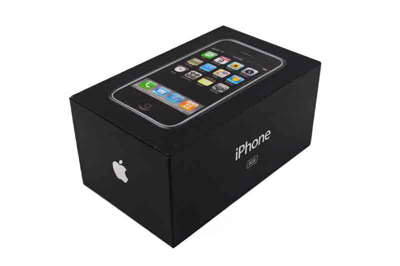
One example of this method being used in production is the iPhone box (as shown below). The box is black because black represents the unknown and mystery, it makes the buyer / audience feel curious and want to buy the product. Another reason why it is black is because it represents power. This suggests that the iPhone is a very powerful phone.


Image result for iphone box


Colour theory is used in a very wide range of areas. These include:
  • Adverts
  • Film Production - Trailers
  • Product Design
  • Packaging
  • Signs
  • Logos and Icons
  • Photos
There are many different types of terms used in colour theory. Here are the key ones:

Analogous - Colours next to each other (orange & red)
Complementary - Opposite colours (red & green)
Split Complementary - Two colours close to each other and one at the other side of the colour wheel
Triad - Colours that join in a triangle in the colour wheel
Tetradic - Two pairs of colours arranged into two complementary pairs
Monochromatic - Just one colour, different shades


Analogous

Complementary
 

Triadic
 

Split-Complementary


Tetradic


Ontology [ontological] - Perceived wisdom (eg.Sun relates to yellow, grass related to green, sea relates to blue).

We also played an online game, which helped us understand the main terms of Colour Theory.


Wednesday 21 September 2016

Project Connect - Final Preparations

Main Objectives

  • Finish researching Project Connect
  • Review all findings
  • Amend photos taken and apply improvements

Work Completed

I have reviewed all resources associated with Project Connect and I have edited photos I had taken the previous day. Proof for my work can by shown below: