- Readable
- Noticeable
- Sizable
- No negative space
- Easy to read fonts
Point size: size of font
Line length: Howe many characters on a line
Leading: Space between lines
Tracking: Space between letters
Kerning: Space between pairs letters
Font families
Serif's
Sans-Serif's
Script
Decorative
Leading
Good leading
The quick brown
fox jumps over
a lazy dog.
The spaces between the lines are evenly spaces and the tops and bottoms of the letters (ascenders and descenders) are not colliding, which makes it easier to read.
Bad leading

Hard to read, ascenders and descenders collide and looks a jumble
Bad leading
The quick brown
fox jumps over
a lazy dog.
Too much leading causes it to look too spaced out and shows too much negative space (or white space).
Tracking
abcdefghijklmnopqrstuvwxyz
a b c d e f g h I j k l m n o p q r s t u v w x y z
Kerning
Narrowing the tracking between certain letters to look more together.
K eep
- Readable
- Legible
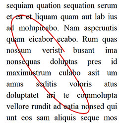
Rivers
Rivers are white spaces of white spaces that run through a paragraph of text.
Legibility
Needs to be readable on whatever device (large PC Monitor and small mobile screen)
Readability
Can you read the words?

The colour choices are very poor and you cannot read the text clearly.
 |
| Good readability |
You can clearly read the text as the colours nor the font is affecting the appearance.
Font Styles


Examples of 'Serif' and 'Sans-Serif' fonts
 This poster uses Serif fonts in a way that applies to the older target audiences (such as over 50s). The poster also uses Serif fonts in a way that represents it in a classical way and that it's more mature than other standard products.
The leading between the main title is narrow to show that it is all one section. However, the leading between the subtitles are much wider. This is to fill up any negative space in that area. There are no clear indications of kerning however the title has narrow areas of tracking. Again, this is the show that it is all one section.

This poster uses Sans-Serif to represent the product in a modern way and that it is slim, clean and modern (just like the font). There is a lot of negative space in the poster but this is used in a positive way to help make the image and text stand out. The tracking on the title is narrow but this is to inform the audience that the product is crisp and sharp (much like the font).
Font Families


This poster is a very good example of a font family. It is where different types of fonts that are different but work very well together. For example, a sketch font will work with a handwritten font as they share the same theme. The sections of text are also very carefully arranged to look like they are together.
 This poster is also very good at showing different font families. This poster shows that retro type fonts mix well with modern fonts. There are also no negative space but the leading and tracking are not too clumped together or too far stretched out. Different boarders, boxes and shapes are used to show the similarities and differences between the font types.
No comments:
Post a Comment